Toolbar and button types
In this chapter you learn basic concepts about the menus in Xeditor.
Default button types
Xeditor offers a couple of default toolbar button types, which can be reused for the most common actions to manipulate the document. The following actions are available out of the box:
- insert element
- convert element
- toggle inline format
Those button types can be easily adapted to your schema and be configured to your needs. They offer everything you need to get the job done, but still let you choose their icon and tooltip.
Each property can be changed by your configuration as required. Here's a quick introduction to the different properties and what they are used for:
| Property | meaning |
|---|---|
| extend | Base button that should be extended |
| contextSensitive | Defines whether this button should be always active or should be disabled by Xeditor core logic. |
| tooltip | Tooltip to be shown for this button on mouse over |
| icon | Icon to be used for this button |
| data | Object containing additional properties |
| data.elementType | Type of element to be handled by button (e.g. on insert button) |
| data.toolbarType | Type of toolbar button, usually used by updateToolbarState in to enable / disable them accordingly |
| listeners | Listeners used within this button, e.g. handlers for click or toggle event |
In addition, Xeditor ships along with a lot of handy default buttons:
| button name | action |
|---|---|
| 'xeditor.save' | Save document |
| 'xeditor.undo' | Undo last action |
| 'xeditor.redo' | Redo last action |
| 'xeditor.copy' | Copy selection |
| 'xeditor.cut' | Cut selection |
| 'xeditor.paste' | Paste clipboard |
| 'xeditor.find' | Open search / replace window |
Insert button
Xeditor offers default insert buttons which are used for inserting elements into the document. The element will automatically be inserted into the next valid position based on the current cursor position.
In addition, Xeditor ensures that the button is only enabled if the configured element can be inserted into the current cursor position. Therefore, the user is not able to produce an invalid document state.
The full configuration of the insert button looks like this:
'button:xeditor.insert': {
	extend: 'button:button',
	contextSensitive: true,
	tooltip: global_phrases['xeditor.insert'],
	data: {
		type: 'insert',
		elementType: null,
		data: {
			wrapPath: null
		}
	},
	listeners: {
		click: editor.eventManager.onInsertButtonClickBound
	}
}
By setting the elementType property, Xeditor knows which element should be inserted. This has mainly two effects:
- When the button is clicked, the element of given type will be inserted
- The button will only be active if set element type is valid at the current cursor position
Convert button
Instead of inserting a new element, a convert button converts the current selection to the target element. For example, this button type can be used for converting one or multiple paragraphs into a list with each paragraph being a list item of said list.
The template configuration of this button type looks like this:
'button:xeditor.convert': {
	extend: 'button:button',
	contextSensitive: true,
	tooltip: global_phrases['xeditor.tags.convert'],
	data: {
		type: 'convert',
		convertToType: null,
		targetElementAttributes: {},
		/**
		 * Attributes applied on target elements after conversion (or insertion)
		 * E.g.
		 * {
		 *   listitem: {
		 *     attribute: value
		 *   },
		 *   list: {
		 *     type: 'some type'
		 *   }
		 * }
		 */
		convertConfig: {}
		/**
		onlyText: true,
				if set to false all children are cloned into the target element,
				if left on true, only the element's plain text is used
		wrapTypes: [],
				used for wrapping the children of each target element of the config type
		convertAllSiblings: false,
				True to always convert all children of the parent of the current element type, false to just convert the selected elements.
				HEADS UP: if multiple elements with different types are selected and one of them is set to convert all siblings
				then all siblings of all types are considered
		disableMultiElementConversion: false,
				If set to true, the button is disabled if more than one of this type is selected.
				HEADS UP: if convertAllSiblings is set to true, there can still be multiple items converted even if multi convert is set to false
		disableMixedTypeConversion: false,
				If set to true, the button is disabled if one of this type is selected aswell as any other type
		keepEmptyParents: false,
				true if empty parents should not be removed after conversion;
				HEADS UP: if mixed types are converted in one go,
				parents are kept as soon as one type is configured to keep them
		beforeConvertFn: null,
				Function to be executed before each element is converted.
				Parameter: element to be converted
				HEADS UP: the function must return the element that should be converted.
		afterConvertFn: null
				Function to be executed after each element was converted but before each
				element is added to final elements list and inserted into the suitable parent.
				Parameter: converted element
				HEADS UP: the function must return the element that should be inserted after conversion
		*/
	},
	listeners: {
		click: editor.eventManager.onConvertButtonClickBound
	}
},
A button that converts selected paragraphs to a proper list would look like this:
{
	extend: 'xeditor.convert',
	icon: 'fa-list-ol',
	tooltip: global_phrases['xeditor.tags.list_ordered'],
	contextSensitive: true,
	data: {
		convertToType: 'list_item',
		wrapTypes: ['list_ordered'],
		convertFromTypes: ['p', 'subheading'],
		convertConfig: {
			p: {
				onlyText: false
			}
		}
	}
}
In this case, each p element (paragraph) will be converted to a list_item element. The complete result will then be wrapped within the list_ordered element in order to create a proper list structure.
Convert or Insert button
The convert or insert button is basically identical to the convert button, with one little difference: If the convert action can't be performed, the convert button would be disabled. However, the convert or insert button would still be active.
When pressed, the configured target element would be inserted as a fallback to the conversion handling.
The configuration of the button is identical, apart from the base button that is extended (convertOrInsert instead of convert):
{
	extend: 'xeditor.convertOrInsert',
	icon: 'fa-list-ol',
	tooltip: global_phrases['xeditor.tags.list_ordered'],
	contextSensitive: true,
	data: {
		convertToType: 'list_item',
		wrapTypes: ['list_ordered'],
		convertFromTypes: ['p', 'subheading'],
		convertConfig: {
			p: {
				onlyText: false
			}
		}
	}
}
Toggle inline format
Those button types are reserved for handling of inline formats, like bold, italic and so on. They will apply selected / configured inline format to the current selection (if valid). In addition, they will be toggled upon click and / or when the same inline format is selected. Untoggling them will remove the inline format from the current selection.
The base template for this button type looks like this:
'button:xeditor.inlineformat': {
	contextSensitive: true,
	textMode: 'menu',
	checked: false,
	data: {
		type: 'inlineFormat',
		pluginId: false
	},
	listeners: {
		toggle: Ext.ux.xeditor.Util.generatePluginButtonListener(editor, plugins, 'onInlineFormatButtonToggleBound')
	}
}
If we wanted to configure a button that applies the element bold to the current selection, the button would look like this:
{
	extend: 'xeditor.inlineformat',
	icon: 'fa-bold',
	data: {
		elementType: 'bold'
	}
}
Icons
We use Font Awesome for our icons.
For example for an Xeditor toolbar button you could change the icon the following way:
createToolbarConfig: function(editor) {
	return [
		{
			extend: 'xeditor.save',
			icon: 'fa-address-card',
		},
	]
}
With this code you use the logic from the pre-configured save button of Xeditor but use another icon.
Menus and dropdowns
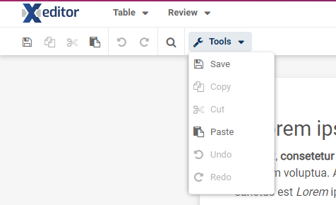
Let's say we want to have a dropdown containing subitems in our toolbar, this can be easily done in Xeditor. Basically we create a new button containing the configurations we want (icon, text, etc.) and add all required subitems to it.
For example, a button that contains some default Xeditor buttons would look like this:
{
	icon: 'fa-wrench',
	text: global_phrases['xeditor.toolbar.tools'],
	textMode: 'always',
	menu: [
		'xeditor.save',
		'xeditor.copy',
		'xeditor.cut',
		'xeditor.paste',
		'xeditor.undo',
		'xeditor.redo'
	]
}
Resulting button would then look like this:
As you can see, we created a button, that when clicked opens a dropdown containing our buttons.
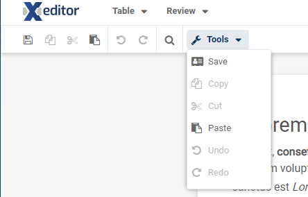
Of course we can still use the extend mechanism for changing the configuration of an existing button. For example, if we would want to change the icon of the save button, our code would look like this:
{
	icon: 'fa-wrench',
	text: global_phrases['xeditor.toolbar.tools'],
	textMode: 'always',
	menu: [
		{
			extend: 'xeditor.save',
			icon: 'fa-address-card'
		},
		'xeditor.copy',
		'xeditor.cut',
		'xeditor.paste',
		'xeditor.undo',
		'xeditor.redo'
	]
}
and would render to:

